I was asked to review a game recently. The game was a simple puzzle game, something we’ve seen around. It had some cool level design, but the overall experience was underwhelming.
One of the thing I noticed is that screen real estate wasn’t used optimally. Buttons were too small, important elements weren’t visible enough and the camera was distant to the puzzles.
In the grand scheme of developing a game, developers -especially solo developers- can have blind spots. Everyone has their own strengths and weaknesses and this developer’s strength was more about the puzzle design.
When thinking about screen layouts and how to optimize screen real estate you need to be very deliberate in your decisions. There are a couple of things to take into account, such as the importance of each element in your game. You can break importance up in multiple segments, such as importance to functionality, importance to communication of function, importance of game feel, importance to theme, importance to story and there are probably some more factors that could possibly be added to the pile of importance.
In addition, games and particular genres and even particular devices have conventions that player’s expect. It is important to make very deliberate choices if you want to break those conventions, but in most cases you want to adhere to them.
After having a clear understanding of the importance of every element on screen, it is simply a matter assigning the amount of space it deserves. The most important element needs the biggest amount of space, and the least important elements need the least amount of space.
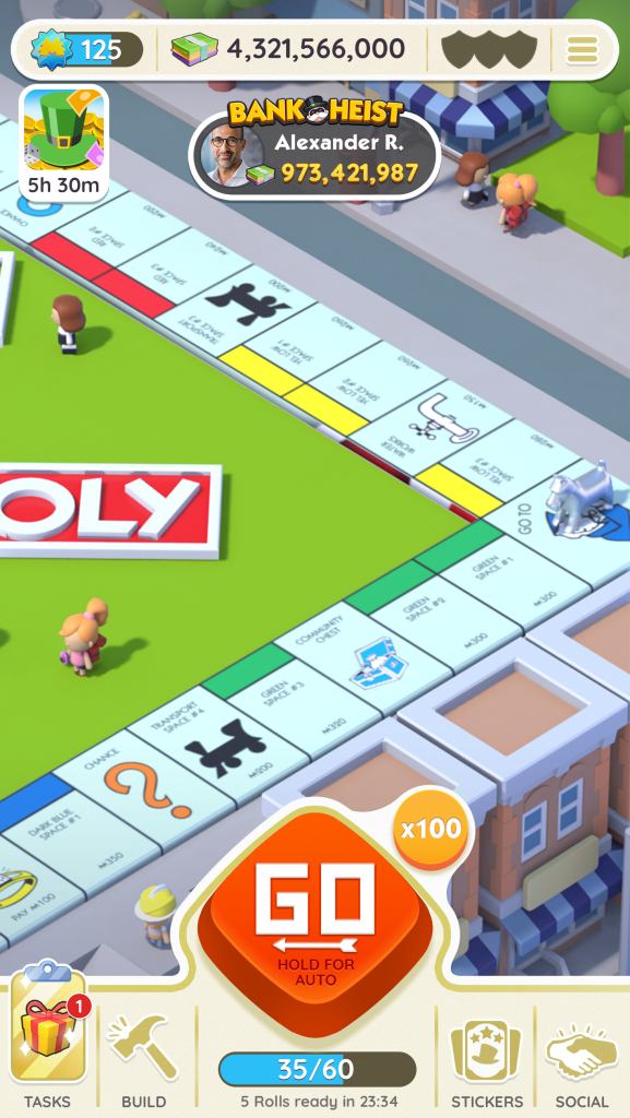
Consider Monopoly go and it’s visual hierarchy and the real estate every element occupies.
There are 2 main things that stand out, the monopoly board and the giant GO button.
It is logical and intuitive that the board is a big part of the experience and no one would question to make the gameplay field occupy the the largest space on the screen.
But it is undeniable that the big GO button is the center of attention. Your eyes are automatically drawn to it, due to its size and contrasting color. It communicates “press me” and “easy one button game”. It screams to the player that this is a deliberate design decision and players are drawn to these clear decisions.
Deliberate design is the key.
Don’t let circumstances decide anything about your game, every decision needs to be deliberate and conscious, as your players will feel it without them understanding why.