Skip to content

Author: Paolo

Data informed lenses

I’m just a regular-everyday-game-designer. The best game design book is The Art of Game Design.

I always use its deck of lenses. In my case:

  • I used them the first years of my path trying to convince people more expert than me (with scarce results)
  • I abandoned them to focus on data-driven approaches. I was readapting industry trends and practices to the games where I was working on. That is what a mid-game designer does in free-to-play.

Now with the experience, I am integrating those into my workflow again! Thesis, antithesis, and now synthesis.

Take a look at this one.

How can we use this in the data hegemony we have today?

You want to make a new game and need to run a couple of CPI tests, IPM, or whatever. You want to find the right experience to design.

  • What emotions do you want to show in your creatives? why?
    • KPI: Number of impressions
  • What emotions are Players (including me) having when they decide to click? Why?
    • KPI: click-through rate (CTR)
  • How can I bridge the gap between the emotions players are expecting and the emotion I’d like them to have in the game?
    • KPI: Installs per mile (IPM)

Creativity and patience

For me, there is a direct relationship between creativity and patience. Ideas need to rest before being properly evaluated. Teams need to have the space to make their own journey and thoughts to make a game happen.

Most games never get published. This is due to many factors. But, a good pre-production phase helps mitigate the risk of not seeing the light.

I’ve read many articles explaining how AI tools help speed up the pre-production stage of a game. Some say that companies can also create content faster. I am very skeptical on this point.

In the pre-production phase, a team measures its potential toward a concrete challenge. The AI tools promise to give us concept art of a pretty high standard in minutes. We can also create stories and document templates. We can get quick code snippets.

But then we’ll find ourselves having to edit here and there. This editing process is different from the process that created successful games.

Since when did we decide that faster is better?

A good dish takes time to cook. A good vertical slice or demo, too. People need time to make meaningful connections, the sparks that ignite the engines. If we entrust this process to machines, then we end up working for the machine.

I enter my prompt and await the results. I review and analyze them. I iterate with these results by introducing more prompts. I review everything and make my changes. Instead of me acting and creating, it’s like I’m making corrections to an assistant. And it’s one of the worst assistants because it doesn’t actually think!

Fail faster is good advice, but it doesn’t mean we have to rush things. If something not created by us fails, it will be more difficult to grow. We will have no memory or connections that will make us understand which steps need to improve.

When did we decide that jumbled datasets are better than looking for references?

People need the process of searching for references to achieve creative goals. While the result of a prompt may appear to have excellent quality, it is still a mindless mixing of elements.

Our urge to have “the thing” now causes us to end up feeding a machine that will create something average. It makes us disperse in a mass.

The process that created the hit games that are on everyone’s lips works differently. There are two types of goals, project goals and personal goals. Every maker must have time to reflect. This time is invested in looking for references and organizing them. The same goes for an artist, a writer and a programmer. If this process is skipped in the name of speed, we will be acting like monkeys. Can we make something good? Just by chance.

Is it possible to use these tools in a healthy way?

The quick answer is no because datasets are a sophisticated intellectual property assault.

For the extended answer, imagine that there is no ethical/legal problem. Assume that the datasets are completely legitimate.

These tools can be used to unlock meaningful internal conversations for the team.

If I, a game designer, have to communicate some concepts to artists, these tools can facilitate my work. If a producer is briefing game writers, these tools can help estimate the number of words to use.

AI tools can help us learn to communicate with people belonging to other departments.

There is a direct correlation between the time a team works together and their odds of success. We should foster this necessary time with patience.

  • Instead of thinking about speeding up critical passages, let’s improve cross-department communication.
  • Instead of trying to get to the end faster, let’s improve our understanding of how everything contributes to it.

The art of vanity

Vanity metrics are metrics that are not used to make strategic decisions. They are used internally and externally by a team to make a good impression.

During the development of a video game, some useful metrics can become vanity metrics. The measure of MAUs, Monthly Active Users for example is often used as a vanity metric. An MAU is a player who has logged into the game at least once during the month. It is a measure that says little, with which few decisions can be made. Yet, if we have many MAUs, our partners and investors will be happy to know about it.

Another vanity metric I see in the world of premium development is the number of wishlists on Steam. Steam algorithm recommends your game based on the speed of getting wishlists. Wishlists are useful, but the metric representing the overall number is not. I have never seen a single company making strategic decisions based on that number. A premium games company decides to make a game and goes until the end. Having many wishlists motivates the team and piques the publisher’s interest. A textbook vanity metric.

Are vanity metrics useless?

Absolutely not! They help move things along, they help with certain discussions. I compare them to the placebo in medicine. Placebo is proven to work on so many occasions. Monitoring, presenting, and discussing vanity metrics allows us to unlock many situations.

If a game has tens of thousands of people returning every month at least once, this opens doors to investors. The fact of having many wishlists allows a publisher to focus their campaigns more on our game. The team benefits from it because it’s easier to prove that artistic decisions are the right ones. Proving artistic choices is hard, art has a strong aesthetic component. That’s where vanity comes in!

Data-informed indie development

I have a soft spot for indie game development. Yesterday I listened to the words of a developer friend who was generous enough to share his battles.

The metrics coming from the Players behavior inside of the game are ignored. This is very different from the game-as-a-service approach.

Game design has an artistic and a scientific component. The latter is based on hypotheses, theories, and experiments. The experiments before were only manual (playtest). After the advent of big data, machines can help us simulate the real world and conduct other kinds of experiments. Free-to-play games aim for a very high volume of players, that’s why you need a data-informed approach to update them properly.

Indie games, on the other hand, keep their focus on creating an original idea designed to please a niche. They are much riskier because there is no data-informed approach that allows a team to learn from one game to be better in the next. The game develops, publishes, and moves on to the next one.

One trend I see in free-to-play mobile is keeping an eye on the indie world for interesting core loops to adapt. Indie developers should in turn “steal” the data-informed approach to improve their processes. They can develop the next game more consciously.

Indie metrics starter pack

Let’s take the example of an indie Metroidvania game in early access on Steam. Let’s say the team has an update roadmap in mind. As an outcome, they want to create a DLC calendar that makes sense.

First Time Player Experience

The first thing to keep track of is the First Time Player Experience. Represents love at first sight, the hook. Its effectiveness can be measured in two ways:

  1. D1 retention: the % of total players who return to play after the 24 hours.
  2. FTPE Funnel: the % of total players who leave the game at each step that belongs to the first experience. We virtually put markers and measure how many people fail each one.

Difficulty curve

Level design is very important in this type of game. It is necessary to have a beat chart designed to measure the failure rate of each segment or level of the game. I suggest to measure:

  • Drop rate: the number of players who leave the game at each level or segment
  • Average completion time: the average time to complete the level or segment
  • Average attempts: the average number of attempts to complete the level or segment

This will measure the difficulty of your game and where you should tweak the levels or segments. In this way, during early access, we can make fixes effectively not just based on what we read on reviews.

Retention for DLCs

Last thing, the metrics needed to create a post-launch DLC roadmap. The best way to create an effective roadmap is to understand which game features people engage with the most. Players may prefer to find secrets or exciting battles. We can measure the retention and engagement of players who:

  • unlock certain achievements
  • eliminate many enemies
  • they discover secrets
  • they spend more time reading the dialogues and exploring
  • they use certain skills

Retention is measured by days. We need to check if a player returns after 24 hours, after 48, 72, etc. Those are, respectively, D1, D2, D3… retention!

Engagement is the number of times the Player runs the game over a 24-hour period. Then we check the average time spent in each game session.

We can use retention and engagement to create cohorts, subset of Players. Then we can think in an effective DLC roadmap to target the most interesting and decide a pricing strategy effectively.

New Apple Vision PRO

Apple has shown that they understand that MR devices compete with traditional screens in the physical space.

They haven’t made the same mistake as Meta, of promising virtual worlds where we can meet our friends. The promise is easy to make, very difficult to execute. Also because reality always has more weight than virtual worlds, who cares? They didn’t speak about the metaverse or anything like that. They forged the new term “spatial computing”.

Apple in its typical way of communicating things offers us a simple message. Buy Apple Vision PRO and you will have how, where, and when you want all the screens you want. No more arguing with your wife about where to put the television. You can wash the dishes and have the news of the day ahead of you. You can join a business meeting without having to switch tabs to check your social media.

  • The current price is for early adopters and companies that want to explore the potential of this device, not for the mainstream.
  • I’m not sure if this device can overcome the natural instinct of the human being not to want his face covered.
  • The battery promises a duration of two hours, which seems few to me for use cases.
  • I expect a change of direction in Meta communication for the new Quest 3, now.
  • “Spatial Computing” is still a hard wording for the mass market.

Games with soul

I’ve been giving From Software games a quick spin lately. Dark Souls, Bloodborne, Sekiro. Late to the party, I know.

In this age of big announcements of new tools that save time and money, these games are a breath of fresh air for me. The genius of these titles lies in the fact that they have found a system. That design is for a very specific type of audience that buys and plays good games.

I don’t see huge technological feats, they have found a way to reuse graphic assets meaningfully. The studio owns in-house level design patterns that they reuse and adapt to every game. In this way, the development is dramatically simplified.

These games exude pure passion and great design techniques. Good design is not creating super innovative mechanics. It is understanding the players and designing also with costs and time optimization in mind. Is doing that without having to give up human creativity.

I don’t think it’s possible to create games of this type working with a clock in hand to check the time of going home. Inquiring on the net, I found information about the team. Passionate people who work a lot more than normal without bothering to define this as “crunch”.

This type of development is not for everyone, but we can all learn from this. Don’t trust technologies that promise to replace human creativity. With the right process, we ourselves are able to find the best ways to optimize time and costs.

The unpolished trend

In the last couple of years, my LinkedIn is filled with claims regarding community-driven / community-led games. The search for new business models to give more fresh air to one of the most fresh businesses in the World and attract investments often leads to something unusual.

It seems at first sight like an interesting path to take, because everything is fast. If you are lucky, you may get millions of downloads. This without having to face all the challenges that people that make real games struggle to deal with every day.

Yesterday I was watching a video with the new Supercell game, Floodrush.

I believe that Supercell is trying out the new features from Google. Their new beta program provides lots of tools for building up a community early. Please, look at the game.

Floodrush is an unpolished game, it’s too early to launch it. The goals aren’t exciting, the camera has issues, the controls aren’t intuitive and the portrait doesn’t feel like the right layout for a game based on curiosity and discovery. Supercell has probably fallen into the trap of launching something too early and seeing how it goes. To me, it is not the right strategy.

If something goes more or less well, your competitors will surely catch up with better solutions early. You are revealing the result of your research. If I look at the last Supercell releases it is clear that discovery and exploration are the next thing for them.

Game design is also a form of art

And as artists, we cannot put the audience first. The audience is the most important part of our job, and for that, they deserve something great, something final, something polished. If you try to do what they want you end up doing something average and mediocre.

As game designers, we have lots of tools to spot the weakest parts of our craft and improve them. But we need a clear vision and we need to deliver it in the best quality in order to find success.

Is the next trend just throwing things at people? I have seen this in hyper-casual gaming, I see this in hybrid-casual. I didn’t expect to see this from the masters of free-to-play.

Internal and external storytelling

Everything tells us a story. Human beings have natural connections that make them very sensitive to narratives.

We create internal ones and receive external ones. The internal ones are personal to each one and depend on a whole series of factors. External ones arrive massively in recent times.

When I was 12 and in my little room playing with my Game Gear, the only external narrative was “orders from above”.

speaking of which, do you remember this game?

Today, when I’m relaxed playing on my smartphone, I’m constantly being stimulated by other narratives. Notifications, messages, calls.

As you can imagine, this impacts the storytelling of the gameplay experience I receive.

Some of my favorite games take 10 seconds to start. They show me the main screen and, while I check the things to do, a series of messages and offers appear. I have to close windows to continue with what I want to do.

In some cases, there is interesting news, no doubt. But everything contributes to creating narratives. It’s not the same as placing a pop-up in front of me or seeing a bird fluttering over the city I’m building and deciding to capture it to discover that it contains a message…

Especially if, at the same time, my wife is reminding me that I have to buy bread and I get an important email from a client.

External narratives are getting complicated and that makes my job more interesting.

Flowcharts and UX flows

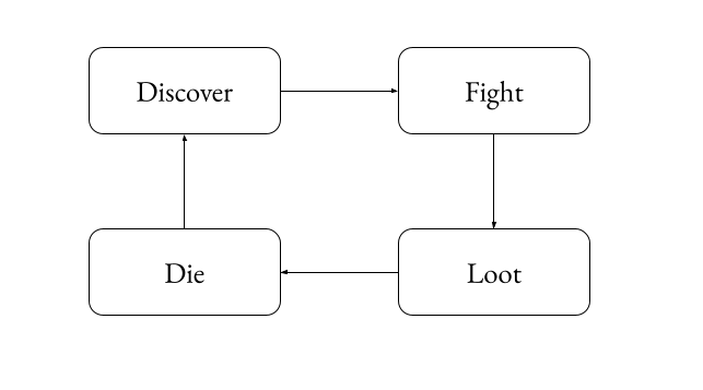
The difference between a flowchart and a UX flow is that the first is drawn from the point of view of the game, while the second is from the point of view of the players.

After writing a brief for a new mechanic or feature, specifying everything in a flowchart helps resolve edge cases. Useful before going on to detail the configurations necessary to unlock the programmers.

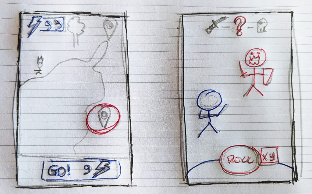
After designing UI wireframes, a UX flow helps to find missing pieces. Very useful for going on to detail the graphic assets needed to unlock the artists.

If we don’t have time and we need to be quick, the flowchart is the least essential of the two.

On quality and passion

Over the last couple of weeks, I’ve invested a lot of time listening to industry podcasts. Normally I do it while I’m cooking, before talking to my parents (as a proud Italian I talk to my parents everyday xD).

Listening to the experts, their judgments, and their concerns it seems that there is no point in doing mobile free-to-play if you do not:

– you find ways to have cheap installations

– create a pay-to-win game

– you save a lot on artistic production to ensure a high frequency of new content

Added to all this is the obsession of investors with numbers. If certain numbers don’t add up, it’s not worth investing.

One thing to be clear: I agree in general, even if my artistic side suffers. It’s true that a large part of my job is to ensure a design that allows for flexibility and scalability.

Quality and passion

In my experience, however, I have seen that there are some things that are constant in all games that we could define as quality:

– A game’s startup time is key to its success

– loading times in the game mark the difference in metrics

– game crashes are directly proportional to making people come back more times

– the number of steps needed to get to what you want makes all the difference. It’s not the same to tap PLAY and start playing as it is to tap PLAY and navigate a couple more screens.

Another thing that is not said enough is the importance of having a team that likes the game they are doing. We don’t make games for us, we are professionals and we make them for the players. But we feel clearly when we have a nice product ahead, even if it’s not for us.

It would be great to find a way to convert quality metrics and this sort of sensitivity into numbers on a spreadsheet. But I am afraid is very hard. Maybe it would convince more business people to take the right decisions.

Have a nice week everyone!